google ad sense 728 x 90
New Beolit 12, A Portable Wireless Speaker with AirPlay for your iPhone from Bang & Olufsen.
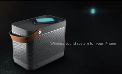
above: A still from the Beolit 12 commercial plays up the picnic basket-like shape.
The first product from Bang & Olufsen's new brand, B&O Play, has been chosen as the "Coolest New Speakers" by Gizmodo at the 2012 CES (Consumer Electronics Show).
With a full-grain leather strap, a solid aluminum grill, illuminated controls, 120 watts of output, a built-in power supply, and an 8 hour rechargeable battery, the Beolit 12 is a portable wireless speaker that features Apple’s AirPlay technology.
Designed by Cecilie Manz for B&O, it comes in four different colors and is said to arrive in Bang & Olufsen showrooms and select Apple stores later this month with a starting price of $800.
The television commercial promoting the new product plays off on its portable picnic basket like shape with an urban high fashion Little Red Riding Hood:
The press release:
Bang & Olufsen, the global provider of luxury, integrated audio-video solutions and services, and B&O PLAY, the company’s new brand focused on a more playful and portable product portfolio, are announcing its first product, the Beolit 12 portable music system. Beolit 12 will defy industry standards with its cutting-edge sound quality, flexible application and distinct, compact design.
Designed by Danish designer, Cecilie Manz, Beolit 12 follows a design language that is a direct reflection of its use: convenient, robust and casual. Beolit 12 follows the success of the BeoSound 8 sound system for iPad/iPod/iPhone docking, with a combination of excellent sound performance, distinct design and craftsmanship, and portable wireless operation.
“With its unsurpassed sound performance and striking design, we believe Beolit 12 will resonate with both Bang & Olufsen enthusiasts and now a new and wider customer demographic, due to its convenience, price point and fashion-forward style” states Tue Mantoni, CEO Bang & Olufsen. “We believe it bridges a gap in the market by delivering a high quality listening experience and still having the convenience of playing music from ones portable digital device or smart phone.”
Beolit 12 features Apple’s AirPlay technology. It allows you to play music wirelessly from your iPod, iPhone, iPad, Mac or PC when connected to your wireless network. It is designed to be portable and has a built-in power supply and a rechargeable battery. The power cord packs neatly away inside the system when not in use. The rechargeable battery has the capacity to charge an iPhone or other connected device and play back music for up to 8 hours at normal sound levels.
“By combining Bang & Olufsen’s 86 years of experience in sound and acoustic technology and advances with the latest wireless technology, Beolit 12 allows the user to play pristine music from their digital devices,” states Henrik Taudorf Lorensen, Vice President B&O PLAY. “We have packaged all of this technology in a compact solution and wrapped it in a beautiful hand-assembled aluminium casing which can be moved around freely with no cables by simply grabbing the leather-strap.”
Beolit 12 is a tribute to Bang & Olufsen’s ever-popular transistor Beolit radios from the 1960’s, and similar to its early predecessors, it presents a compact form, yet a robust sound reproduction. Also, despite its relatively small size, the Beolit 12 offers a best in class portable sound experience. Its 120 Watts digital Class D power amplifier system individually drives two 2” tweeters and a 4” woofer to deliver powerful, accurate sound performance that comfortably fills a middle sized room. The sound system is designed and tuned by the same sound engineers that delivered the award winning BeoLab 5 loudspeakers from Bang & Olufsen.
Attention to detail has always been a Bang & Olufsen signature competency, and this is reiterated under the B&O PLAY brand. Material choice and craftsmanship are no exceptions here: An Italian full-grain leather carrying strap is diagonally mounted for stability when the unit is carried, and the solid aluminium loudspeaker grille wraps smoothly around the unit, making the loudspeaker fabric visible behind the grille to allow for different discrete colour options. The top of the unit, with its volume, power and network controls has a non-slip rubber insert, so you can safely place your mobile device here while charging or playing.
The Beolit 12 represents the company’s move into a new range of products designed specifically for a new generation of mobile, digital, quality-conscious customers. With a recommended consumer price of EUR 699 in Europe and $799 in the USA, the Beolit 12 is the most affordable sound system from Bang & Olufsen in many years, and therefore the company believes its sales volume will surpass the ever-popular BeoSound 8 figures.
Beolit 12 will begin to arrive in Bang & Olufsen showrooms, Bang & Olufsen Online Store and Apple Stores (including Apple Online Store) late January 2012 in the dark grey option. Additional colors will include yellow, blue, and light grey, and those will arrive in showrooms this Spring 2012.
all images and info courtesy of Bang & Olufsen
Specs:
•Class D digital amplifier with a total of 120 watts.
• 2.1 stereo system with: 2 x 2” tweeter and 1 x 4” woofer
• Dimensions W x H x D: 23 x 15 x 18.8 (cm)
• Weight: 2.8 (kg)
• Colours: Yellow, dark grey, blue, grey
Learn more about it here
Funny Tees for Those Who Prefer A Little Cushion for the Pushin'
In stark contrast to yesterday's post about the controversial ad campaign for Equinox gyms (people protested feeling the models were far too thin), here's a company whose apparel celebrates those who pack on a few extra pounds- and the people who love them.
Sick of dating girls who order a salad with dressing on the side? Or men whose butt is smaller than your own? Whether a foodie, a fattie, a chubby chaser or just a chubby in training, Dpcted of St. Louis has an adorable and clever line of t-shirts for those who prefer a little meat on them bones.
Along with bulge, beards and booze are a few of their other subjects.
And a few others:
All images courtesy of DPCTED
And yes, sizes available are an appropriate Small up to 5XL.
Beginning yesterday, for one week only, the discounted online design flash sale site, Fab.com, has them on sale. (Fab.com is invite only. Please use the following link to register: http://fab.com/y06r4g)
Fab is not selling all of their tees. For a wider selection, or if you miss the sale, be sure to visit DPCTED's online store here.
Knotted Skull Keyrings With Swarovski Crystals from Alexander McQueen.
Combining two of the most prevalent trends, skulls and Swarovski Crystals, these keyrings from Alexander McQueen are fun and functional accessories that make a nice gift for any hipster regardless of gender or age.
Available in a silver finish with Swarovski Black Diamond Crystals or a gold finish with colored Swarovski Diamond Crystals, the keyrings feature a knot on one end and a skull on the other. Made of solid brass with anti-allergic finish, the knotted end simply screws off so you can easily add the keys.
Gold Knotted Skull Keyring by Alexander McQueen:
$215 USD
buy the gold finish one here
Silver Knotted Skull Keyring by Alexander McQueen:
$215 USD
buy the silver finish one here
Equinox Defends Their Controversial Ad Campaign Shot By Terry Richardson.
You may or many not have read the glut of recent articles highlighting the controversy over the "skinny" models in the latest ad campaign for Equinox Fitness Clubs shot by photographer Terry Richardson. According to Fashionista, Huff Post and plenty of other blogs, gym goers expressed disappointment in the 'thin' physiques displayed in the ads.
above: the exterior of the Equinox gym in Beverly Hills, California
The campaign was meant to illustrate the connection between fitness and fashion, but comments and criticism on Facebook and other sites allude to the fact that some might prefer fit and healthy looking models as opposed to runway thin models in the ads.
The gym chain has since responded, defending not only Richardson’s photos but their “deliberate” decision to run with them. Women’s Wear Daily reports that the chain disagrees with the mob of gym goers who stormed the Equinox Facebook page with comments demanding that the women featured in the ads look fit and healthy, instead of runway thin. Equinox’s executive creative director Bianca Kosoy told the paper:
“Our campaigns exist at the intersection between fitness and fashion; they are intended to be thought provoking and to generate discussion through their deliberate synthesis of personal motivation and high fashion photography.”
Frankly, the controversy regarding this continuation of the campaign shot for the chain of gyms by Terry Richardson is most likely more attention than the campaign warrants given that there's nothing extra interesting, compelling or memorable about the ad campaign.
Below are 12 ads shown from the campaign and the inside scoop behind 9 of the shots, straight from the set, from Executive Creative Director Bianca Kosoy.
Don't Let Them Eat Cake
"This obscenely expensive cake that we meticulously designed for this shot almost didn't make it. When the delivery guy showed up, someone directed him to Craft Services and it was about to get sliced for dessert. As you know, you can't have your cake and eat it too."
Shorts Story
"Believe it or not, this was one of the hardest shots to style, wardrobe-wise. We kept trying on different combinations of collegiate socks, ties, boxers and underwear to get the perfect blend of preppy and sexy. We wanted them to look hot, but not over the top. I mean, we are promoting higher education here."
Frankie Says Relax
"Terry's signature style inherently dials up the sex factor — each shot is like foreplay. The idea behind this shot was that the couple was recuperating after sex, so I had to keep reminding Terry that we were going for a 'post-coital' feel. He just started yelling, 'Post-coital! Post-coital!' with every pop of the flash! Everyone on set was cracking up."
Sunshine and Rain
"This was the first shot of the day, and it was raining and the weather was just supposed to get worse. We had tents set up and people holding umbrellas over us. The styling, props and location were so flawless and the models were having a blast, so the shot came together quickly. Let's just say we weren't going to let it rain on our parade."
Little Man on Campus
"Little Giuseppe was on set all day because we had to get all the outdoor shots done. He made the best of it flirting with the models and asking his mom if he could take a puppy home. Once he finally got on set he and Terry had this great banter about how much more time he had left. He was a total pro."
Searching High and Low
"The whole idea of the shoot was to create a real highbrow, secret society feel, but when it came down to finding most of the props, like the trophy in this shot, they ranged from actual museum pieces to random garage sale finds from upstate New York. It's the perfect intersection of highbrow and low art."
Puppy Love
"These French bulldog puppies had a bigger entourage than Terry: a breeder, a trainer and a handler. I couldn't believe how well-behaved they were. I actually almost went home with one, but I decided getting a new puppy in the middle of a campaign launch probably wasn't the best idea. Too bad. I was going to name him T-bone — in honor of Terry."
Happy Endings
"This was the wrap shot. It just instantly came together. The stylists and hair and makeup team were all done, and everyone sat on the grand staircase in the foyer enjoying the view and watching Terry do his thing. This is what I call a happy ending."
Earlier ads in the "By Equinox" campaign shot by Terry Richardson:
equinox
terry richardson
Braille Burger Video Spreads The Message For South African Fast Food Chain Wimpy.
South African fast food chain, Wimpy, wanted to let visually impaired people know that they offered braille menus in all of their restaurants. To spread the word they built braille burgers that blind people could actually read. With the help of skilled chefs they took sesame seeds and meticulously placed them on burger buns so that the seeds formed braille.
The company’s restaurants in South Africa have used Braille, the international language of the blind, on their menus since 2002 but wanted to spread the message and “let people know that Wimpy is a place where everyone can feel at home”.
Ad agency Metropolitan Republic South Africa had the idea to create 15 individual burgers and sesame seeds were arranged by hand on each one to create a message.
The burgers were delivered to three institutions for the visually impaired in South Africa and taste tested by blind people whose reactions were then filmed. The Art Director for the advertising campaign Dale Mullany said the company were delighted by the response.
"The response we had when these people read the message was worth every moment that it took," Mr. Mullany said.
The video (of which there is also a voice over version for the visually impaired), shown below, claims that through social media and the blind community’s Braille newsletters, the message was spread to 800,000 visually impaired people.
Credits:
Director/Editor: Willian Collison
Executive Creative Director: Paul Warner
Executive Creative Director: Peter Khoury
Creative Director: Wes Phelan
Art Director: Dale Mullany
Copywriter: Keith Manning
Agency Producer: Simone Bosman
Retoucher: Darren Bell
Photographers: (Mike Lewis and Nic van Reenen)
Music: Loyiso Madinga
images courtesy of Wimpy and Metropolitan Republic
news source: African Business Review
Subscribe to:
Posts (Atom)
Please donate
C'mon people, it's only a dollar.