google ad sense 728 x 90
The Winner (And All 29 Finalists) of The Heineken Future Bottle ‘Remix’ Challenge
Heineken has announced the winner of their 2012/13 Your Future Bottle Design Challenge. The winning design (shown below) was created by Fernando Degrossi, who is a graphic designer from Sao Paolo, Brazil.
The Winning Design:
Fernando submitted several designs, a few others of which were finalists and shown later in this post.
To celebrate its 140th year, Heineken put its design elements online and challenged creatives everywhere to ‘remix’ these assets into an iconic bottle, designed for the future. The remix theme gave designers total freedom to delve into Heineken’s past and play with the brand's DNA to create a cool new design. The winning approach remixes five circular Heineken logos from five different decades, and incorporates the red star, Heineken’s famous trademark.
The video invitation to the design challenge:
The winning design and the finalists were selected at a live judging event at Heineken’s space in the heart of the creative community at Milan Design Week, which has been visited by more than 10,000 design fans since opening on Tuesday. Fernando’s design beat almost 2,000 entries and becomes the second Limited Edition bottle that will be produced. It will go on sale around the world in early 2014.
The Top 5 Finalists:
Anna Ptasinka:
Andy Audsley:
Tomasz Wagner:
Fernando Degrossi:
Bartek Bak:
The Other 24 Finalists (in no particular order):
Balazs Kaczper:
Davide Colombo:
Elina Presniakova:
Fernanda Ochoa:
Fernando Degrossi:
Fernando Degrossi:
Ji Yeon Kim:
Johan Bl:
Joris Blomjous:
Milos Dostanic:
Nemanja Djordjevic:
Nicolas Vicario:
Nivedita Sivaprakash:
Paolo Tonon:
Pat Corrigan:
Thijs Mensink:
Victor Correa:
Dominique Hernandez:
Leondios Tsiobanelis:
Marco Bellarosa Architects:
A Serbian designer whose name I do not have the characters to type (I'm so sorry) so I pasted his name above his design:
Sergey Rizhov:
Sergey Rizhov:
The judging panel consisted of designer Joshua Davis; Evan Orensten of Cool Hunting; Mark Dytham of PechaKucha and Heineken’s global head of design Mark van Iterson.
Mark van Iterson, Global Head of Design at Heineken, said "This is the completion of a five month process; a contest that has attracted over 2,000 high quality entries. The use of our heritage in this winning design is really clever and results in a very contemporary iconic bottle. It was a bold step to put our brand history into the hands of emerging designers, but Heineken is a progressive brand and this contest has proved again that opening up in the search for creativity pays off.”
Heineken
Craig Steely's Island Sanctuary, The Lavaflow 7 House.
New and Beautiful Paintings by Stephen Magsig. City Views Opens At George Billis Gallery.
above: Stephen Magsig, 68 Mercer St., Oil on linen, 30 x 24"
I've been a longtime fan of Stephen Magsig's work having introduced you to his Urban Alphabet paintings and his Postcards From Detroit back in 2009.
above: Magsig's Urban Alphabet, a series of small scale paintings of letters from city signs (I own the "A", the "O" and the "K")
Stephen's latest show, City Views, opened yesterday at the George Billis Gallery in New York and features several new pieces that capture the flavor and ambiance of New York. The oil paintings on linen depict urban storefronts, cast iron facades, street corners, neon signs, bridges and city views in Magsig's inimitable style.
above: Stephen Magisg, Manhattan Bridge, Oil on linen, 30 x 60"
Void of human figures, his paintings combine the early morning light of Edward Hopper with an adept realism. Long shadows, empty street corners and closed cafes exude an emptiness while simultaneously appearing inviting. His work successfully combines the aspects of a large inhabited city with the quietude of a personal and private moment.
168 Mercer St., 40 x 30":
54 White St., 30 x 24":
Brooklyn Bridge Shadows, 30 x 60":
Duane St. Shadows, 48 x 40":
Bass Ale, 42 x 36":
40 Walker St., 62 x 48":
Bleeker St. Shadows:
Lincoln Tunnel Ventilation Tower, 24 x 30":
Rheon Cafe, 42 x 36"
281 Church St at White St., 62 x 48":
Nolita Corner, 30 x 24":
Broadway Shadows, 20 x 16":
108 Franklin St., 20 x 16":
Sunday Morning Shadows, 24" x 30":
The show runs through May 25th.
City Views, George Billis Gallery
521 W. 26th Street, B1
New York, NY 10001
April 23 - May 25, 2013
Reception, Thurs April 25, 6-8 pm
www.georgebillis.com
Stephen Magsig website
If you never saw his Urban Alphabet or Postcards from New York, see those here.
Pantone on Draught. The Ultimate Color Guide For Beer Lovers, Beertone, Is Now Available for Purchase.
Here's a Pantone-like color guide that is truly useful for Beer enthusiasts. A brilliant idea from Alexander Michelbach and Daniel Eugster of Switzerland, they have captured accurate colors and compiled a color matching system in booklet form, featuring 202 beers from Switzerland and relevant information about them.
The project was successfully funded via their own social media crowdfunding campaign and is now selling the Swiss edition Beertone color charts, which began shipping April 15th.
Below is an ad and a video they created to promote the Beertone concept via social media:
What is on each card of the Beertone color chart:
Three purchase options - which all come with Beertone stickers and mats, make great gifts for the Beer Aficionados in your life:
Shop for the Beertone color matching system here.
Now, if only they'd sell the wonderfully branded pilsner glasses and beer mugs on their own...
Beertone
Rusted Portraits on Vintage Car Hoods by A Milwaukee Ad Agency Creative Director.
Milwaukee-based artist and furniture maker Michael Stodola, whose day job is actually that of a Creative Director at ad agency Boelter + Lincoln, utilizes found objects in his creation of upcycled furniture, art and objects for his own brand, Milwaukee Modern.
above: The Hot Rod Table and RC Mirror are typical of the upcycled products from Milwaukee Modern.
When Boelter + Lincoln decided to adopt the image of Abe Lincoln for their company, they asked Stodola to create a visual that would help brand the agency. And voila! His oxidized portraits atop vintage car hoods were born. To create his first one, Stodola, who normally uses materializes he comes across or already has, sought out a ’75 Lincoln hood, which he eventually found on Craigslist. After some trial and error, he managed to carve Lincoln’s portrait into the car’s hood to his satisfaction.
Stodola prepared a recipe to oxidize the art into the car hood by using iron filings, sea salt and some chemicals. After he drew the image of Lincoln onto large pieces of paper, he glued it to the hood and ground through it so the image was engraved on the metal. Then he applied the rusting recipe he found on the internet and let the mixture sit overnight.
“It was a pretty remarkable thing to come out the next morning and the hood looked like it’d been sitting outside for 20 years,” Stodola told Earth911.
Ripley’s Believe It or Not got wind of the hood and asked Stodola to make another for their touring collection.
Since the first one, Stodola has created a second Lincoln hood portrait on a 1982 Lincoln Town Car and a Che Guevara hood portrait on a 1962 Chevy Nova.
The Lincoln, Wall art, 64” x 64”:
The rusted image of Abraham Lincoln ground into the paint of a 1975 Lincoln Continental hood. The piece weighs approximately 75 lbs and has been sold. However, they can make more upon request.
The Lincoln 002, Wall art, 63” x 54”
The rusted image of Abraham Lincoln ground into the paint of a 1982 Lincoln Town Car hood. The piece is approximately 35 lbs. This baby is touring in the permanent collection of “Ripley’s Believe It Or Not” museums.
El Chevrolet, Wall art:
The rusted image of Che Guevara ground into a 1962 Chevy Nova hood. Hood is topped with an actual 1958 license plate from Havana. Please contact us for pricing and more information.
About Milwaukee Modern (in their own words):
Milwaukee Modern creates from the soul. We are beholden to no one and the expression found within our work is cemented deeply in self. We love to play, be creative and eat banana cream pie. We also dig the modern movement running headlong into the green movement – it’s where we live. Upcycling the crap into useful, extraordinarily beautiful objects. We’re inspired by many others out there and hope we spur some inspiration as well. Peace.
above: Michael Stodola and his children
Give them a call at 414.232.9788 or email them for pricing and information on their work.
Get The Most Out Of Today's Interactive Earth Day Google Doodle
Today Google celebrates Earth Day with an interactive doodle that captures a slice of nature's subtle wonders. Click around and you'll discover tons of fun and cute options. Day or Night (the sun and moon act as pause and play buttons when clicked upon), Animals walk in and out of the caves, rainclouds you can control, even dandelions to blow upon.
Use the sightseeing checklist below to make sure you do not miss anything!
Google Doodler Leon Hong and collaborators Kris Hom, Mark Ivey, Greg Capuano, and Ryan Germick were responsible for the concept and design. And a very special thank you goes to Kris's high school teacher, Dr. Juan Fernandez, who served as their science advisor.
http://www.google.com/doodles/earth-day-2013
Beautiful Typographic Posters Feature Pop Culture Icons and Quotes.
Graffiti Artists MIRF Create Limited Edition Fragrance Bottle For NY Yankees.
The official fragrance of the NY Yankees has just released their limited edition men’s bottle with exclusive design and artwork done by none other than NYC graffiti legends Mint&Serf aka MIRF.
Mint&Serf's distinctive drippy MIRF, which is featured on both the front and back of the bottle (above) , conveys their enthusiasm for New York, yet also expresses their understanding of the overall brand of the city. "People who know us can tell you that we are both diehard New Yorkers. From Astoria, Queens to Sheepshead Bay, Brooklyn to East Tremont Ave in the Bronx to Victoria Blvd in Staten Island, graffiti opened us up to almost every neighborhood in New York City. We live and breathe New York City," said Mint&Serf. "When it comes to the symbol of New York, there is nothing more iconic and recognizable than the New York Yankees; to think that graffiti we created on the streets of New York will be immortalized alongside the New York Yankees logo is an honor.”
MIRF's distinctive drip graffiti found around New York:
Tagged with #MIRF4Yanks, posters have begun appearing around the city:
above: instagram photo by Chicozen
above: instagram photo by Jposorio
The multimedia artists Mint&Serf were born Mikhail Sokovikov and Jason Aaron Wall. Mint&Serf, collaboratively known as MIRF, produces sculptures, graffiti, photography, public and private installations, curatorial work, commercial partnerships, publications and nightlife experiences. While Mint&Serf’s creativity was originally born on walls of their beloved concrete jungle, the duo’s illegal art morphed into conceptual art theory and commissions for some of the world’s most recognizable brands including Nike, Red Bull, Marc Jacobs and ACE Hotel.
The New York Yankees™ fragrance captures a sporty and confident attitude, creating a timeless, masculine scent that contains fresh wood tones, an invigorating blend of sparkling bergamot, coriander and cool blue sage. The fragrance also evolves to reveal a fusion of crisp ivy leaves, orange flower and geranium, enhanced with rich earthy patchouli, smooth sandalwood and suede.
“It has been an honor and a privilege to work with the New York Yankees, Major League Baseball Properties and now with Mint&Serf on this fragrance,” said Thomas Butkiewicz, CEO of Cloudbreak. “Mint&Serf’s artistic creativity and unique knowledge of New York City will bring an unparalleled freshness to the fragrance industry.”
The New York Yankees™ Limited Edition Graffiti EDT is available now online at at NYYankeesFragrance.com and at Macy’s, Lord & Taylor and Belk.
200ml/6.7oz bottle for $85.
This cutting edge project introduces a new conceptualization for beauty brands; the NY Yankees limited edition men’s fragrance promises to be on every guy’s radar through and beyond Major League Baseball season.
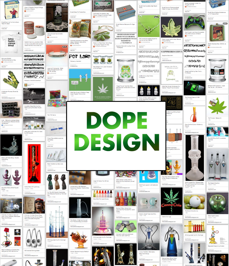
Dope Design. Over 100 Well Designed Items For Pot Smokers.
In honor of 420, I invite you to head on over to my Pinterest board to see over 100 well-designed items related to marijuana.
Big Production For A Quick Bite Is Going Viral: The Last Great Stand.
Using every movie trailer cliché in the book, agency Pablo Escargot created The Last Great Stand, a video concept for Fatburger to portray the franchise’s rapid global expansion in 2013. The two and a half minute mock movie trailer has been rapidly climbing the viral video charts all over the world since its debut.
They parodied the classic action movie trailer, channelling equal parts Michael Bay and Alien to pull off this production that ran on April Fools Day.
Full Credits:
Director -- Gil Freston
Producers -- Mason Wiederhorn and Brian Charles Lehrer
Writters -- Gil Freston and Mason Wiederhorn
Director of Photography -- Brian Charles Lehrer
Sound and Music Direction -- Alec Rasmussen
Associate Producers -- Taylor Wiederhorn, Thayer Wiederhorn, Alec Rasmussen
Original Music -- Tal Meltzer, Phil Patterson and Justin Bleich
1st AC -- Dan Marino
2nd AC -- Jeff Burgett
Production Design and Costumes -- Monique Thomas
Gaffer -- Philips Shum
Key Grip -- Jordan Raabe
Best Boy -- Johnny Marion
Steadicam Operator -- Will Demerit
Hair and Make-up -- Morgan Merrill
Grip -- Wes Chappelle
Production Assistant -- Nathan Eckhous
Editors -- Mason Wiederhorn and Brian Charles Lehrer
Colorist -- Brian Charles Lehrer
Cast:
John -- Tommy Nash
Lauren -- Melanie Williams
General -- Jude B. Lanston
Technical Officer O'Reilly -- Jon Rudnitsky
Technical Officer 2 -- Andrew Pattison
Vanessa -- Charlie Taylor
Soldier -- Wes Chappelle
Special Thanks:
Fatburger, Tiffany Wiederhorn, Bridget Helgerson
Subscribe to:
Posts (Atom)
Please donate
C'mon people, it's only a dollar.