google ad sense 728 x 90

Showing posts with label prefab sheds. Show all posts

A Tiny But Terrific Prefab Home In Brazil by Architect Alex Nogueira


House 12.20 in Campo Grande, Brazil by Alex Nogueira


Copy is courtesy of the architect:
In a 9-meter-long (29.5') and 5-meter-wide (16.4') rectangular space, totaling 45 square meters (about 148 square feet), the orthogonality and the rigidity of the architectural environment create a contrast with the light and stripped atmosphere brought by the colors, by the furniture, by some of the finishes, and by the generous opening which faces the garden.


In this space there are, almost in a symbiotic way, the room, the office, the kitchen, the bedroom, and the hall, where the furniture is the keystone in both aesthetic and functional harmony of this multiple environment. The bathroom is the most conventional setting and it divides the hydraulic wall with the kitchen, but it is turned to the room, privileging this more intimate access.


Generally speaking, the homogeneity of the internal space is an attempt of dialogue with the homogeneity of the external space, the green plane composed by the hearty garden. In this search, both the large sliding glass door and outside deck are responsible for integrating and transporting the external space to the internal one, and vice versa.


The structural system favors the natural look of its different elements. So, there are together, in a mixed system, reinforced concrete with metal profiles. In other words, a metal frame supported by concrete bases, which maintains the construction away from the ground, gives it a certain lightness and a better relationship with the hot weather of the region.


On the front facade, a large layout of horizontal metal louvers not only provides the necessary sun protection but also a uniform, closed, and hermetic aesthetic, in full contrast to the back facade, fully transparent and open. This duality can be understood as a reflection a personality: serious at first, and more open in intimacy.


Exploring a predictable, rigid, and formal geometric body, there was a search for lightness, surprise, and certain enchantment, whether with the yellow sculpture that rests in the garden (made with leftovers of the type "I" metal profiles), whether with the contrasts between the solid wall of exposed concrete and the floating metal wall, whether in the mixture of very different materials such as the simple apparent clay brick (external floors), the transparent glass, corrugated metal closure, unpolished marble, yellow wall, or even crude and poorly finished concrete... Even though it is a small construction, the search was for an architectural experience capable of harboring the infinity of feelings.

Principal Architect: Alex Nogueira
Project Details:
• Year 2009
• Work started in 2010
• Work finished in 2013
• Plot (m²) 720
• Total area (m²) 45
• Status Completed works
• Type: Modular/Prefabricated housing /

Photos © André Barbosa

Architect Craig Steely Partners With Jeepney Projects To Design A Philippine Eagle Reserve Ecolodge With Modern Ecopods.


above: the proposed Philippine Eagle Reserve Ecolodge 
Mindanao, Philippines

Architect Craig Steely has partnered with Jeepney Projects Worldwide to conceive of and design an Ecolodge in Mindanao. His vision includes these beautiful prefabricated ecopods to help create respect and awareness for the world's rarest eagle, the Philippine Eagle and its natural habitat.


Each prefabricated pod is supported on a single pier foundation with supporting guy wires. This allows each pod the flexibility to be placed on any topography as well as the ability to relocate if required. The top prism has a fabric roof with screen walls while the lower prism is translucent and made with locally reclaimed corrugated wood walls. The ecopods can sleep 6 people on the 2 floors.


Presently local farmers create income by slashing forest and eagle habitat, replacing it with grazing land for livestock and pushing the already dwindling Philippine Eagle population closer to extinction.


above: The Philippine Eagle Foundation uses nonreleasable male eagles that can’t be released for artificial insemination and public display.

Carefully managed eco-tourism will create a stronger local and international awareness for the eagle’s plight as well as the financial means to employ and subsidize the local residents. Ultimately, the goal is for the local people to see the value in stewarding the land and change their perception of the eagle from a pest to an asset.

About the architect:
Craig Steely is a San Francisco and Hawaii based architect. He opened his architecture studio in 1995 and has been a guest lecturer at UC Berkeley and at Cal Poly and at many conferences including the Monterey Design Conference. His work has been awarded recognition by the American Institute of Architects and published widely in books and periodicals, among them Dwell, Sunset,Architectural Record, California Home and Design, the Los Angeles Times, the San Francisco Chronicle, and the New York Times. In 2009 he was selected as an “Emerging Talent” by the AIA California Council. Jeepney Projects is proud to have caught his interest and support.

For more information: jeepneyprojects.org

A Golden Workshop Pavilion For The Golden Glory Exhibit


A temporary pavilion/workshop for the exhibition "Golden glory. Medieval Treasures of Art in Westphalia" at the State Museum of Art and Cultural History Cathedral Square in Muenster was created by the architectural group “modulorbeat”, consisting of Marc Günnewig and Jan Kampshoff. Commissioned to design the pavilion, they had already created a portable, temporary pavilion in 2007 for “skulptur projekte münster” (show below), which garnered much attention, not only due to its gold-coloured façade.


modulorbeat developed their new 2012 creation for “Golden Glory” together with students from the Münster School of Architecture (msa). At the time of their commission, Günnewig and Kampshoff were searching for a seminar theme to teach at the school.


In varying groups throughout the semester, several designs were developed, linked, revised, discarded and then revised anew, once the construction’s precise location on Domplatz had been determined. With a second group of students, they commenced planning and the realization of the 95 sq. metre pavilion, which was completed in six weeks’ time.


In order to compensate for the slope of the Domplatz, the pavilion was built on top of simple piles made of in-situ concrete and wood, which would leave no traces once they were dismantled. The building has a cross-shaped layout with four “wings”. Each wing open inwards like a funnel, so that the layout is more reminiscent of an abstract windmill than a crucifix. The effect is an inviting gesture to visitors, as the inside path opens up onto the central workshop area.


The walls are made of full wooden plywood panels. Indoors, the wood is visible, lending the foundry area a robust, resilient atmosphere. From the outside, the compact pavilion seems similarly robust, but here the façade is covered in eye-catching, gold-copper metal panels (more on that material later in the post). The furrowed, vertical profile of the shimmering panels along each of the four wings narrows towards the centre.


This creates a dynamic rhythm, in which the sparkling metal mixes with a play of light and shadows that shifts with the passing of the sun overhead. The small pavilion seems to be a portable, accordion-like construction that could be folded up and transported to another location at any time.


The precise construction achieves a lot with little, while allowing for a merry playfulness: the simple forms and materials gain incredible complexity through subtle and precise displacements, elevating the project to a most entertaining building. Despite its symmetrical layout, it never looks like a cross but instead seems to reinvent itself at every new perspective. This awakens the urge to circle around the building again and again to look through the large openings at the end of the four wings into its centre. Ceiling-high glass elements open up the building completely, so that the view from outside reaches into the foundry and beyond – through the lightly askew axis – to the opposite opening. Suddenly, the small building appears to be amazingly deep. The architecture reflects the theme of the exhibition not only with its brilliant encasement, but much more in the fine workmanship and meticulous details that are unusual, especially for a temporary pavilion.

The Interior:
Using a very reduced selection of materials and colours, the pavilion’s interior design allows for the concentration required by this fine and detailed work. Floor, ceiling and all walls are, like all furniture and other components, crafted from a light coloured wood.


This includes the sliding door, through which the foundry can be separated from the information area. In contrast, everything having directly to do with the work has been painted pitch black: the table lamps, the work surfaces, the screw clamps, and even the oil radiators, lamp cables and the kitchen sink.


The interior was not only designed but also completely built by modulorbeat together with the students. In fact, all elements used are cost-effective, standardized components that can be found in any hardware shop; the consistent design and uniform colour scheme are what transform them into something elegant. This is not merely for design’s sake, but serves as a stage for the foundry’s small protagonists: the golden elements are more recognizable when set against black.

The Exterior:


The material processed for the facade of the pavilion, TECU® Gold, is a product by the copper experts at KME, one of the world’s leading manufacturers involved in the development of metal facade solutions and advising on their application. The copper-aluminium alloy, one of many TECU® brand copper materials, proved to have unique advantages for this project: an unmistakeably beautiful surface that could not have been thematically more appropriate, together with ease of processing and complete recyclability. Not to mention the material’s proverbial longevity and excellent economic performance.


The wave structure in the TECU® Gold facade used a special manufacturing solution by MN Metallverarbeitung, a company based in Neustadt in Holstein specialising in special metal solutions for architecture and design. The patented wellTEC® process developed by the firm has made it one of the few processing companies in the world able to create the most diverse individually tailor-made profiles in every kind of metal construction imaginable. So it was no problem at all for them to produce the irregular wave profile specified by the architects to match their individual ideas.


Thus this marvelous architecture functions on all levels, from big to small. Even from a distance, the golden façade attracts passers-by and indicates the way inside, where the wood and black work surfaces then lead the eye to the tiniest, most valuable things – the objects, which this is all actually about.

This is the most golden gold foundry that Münster has ever seen, and awakens in its visitors what might be the greatest compliment a temporary building could ask for: the wish to call out, “linger on, thou art so fair!”

plans:


Design team: modulorbeat
All Pictures: Pavillon Goldene Pracht, Domplatz, Münster
Architects: modulorbeat and Studierende of the msa | münster school of architecture
photos by Christian Richters, images and info courtesy of Architonic and modulorbeat

Inflatable Pods Pop Up For Commercial and Residential Use: AirClad


With the growing popularity of 'Pop Up' events like fashion shows, art exhibits. concerts, demos, promotional marketing, food fairs and the like, the idea of creating temporary and portable but sturdy inflatable structures that can be furnished, lit and branded is a smart one.


AirClad is the next generation of semi permanent and permanent architectural buildings developed by Inflate, a company that designs and manufactures award-winning, architecturally stimulating stock structures that have been designed specifically to suit the portable and temporary events market.

A dome shaped AirClad structure used for Harper's Bazaar Melbourne Fashion Show

A commercial 12m x 12m AirClad pod with roof terrace to house the Puma Social Club in Spain:


above: rendering for the AirClad structure shown below at Dwell on Design


The AirClad system is, in its simplest form, a structural skeleton with air inflated panels cladding it. The skeleton forms and monoqoque structure support the inflated cladding. The inflated panels offer insulated and structural properties to the finished building and especially allow for a new architectural aesthetic to be achieved. AirClad is a sealed pressure regulated system using very little energy to keep the whole structure in working order.


The AirClad system harnesses a combination of production and performance solutions from the sailing, events industry, contemporary engineering and architecture. The basic system utilises basic engineered ply wood joists, that carry an inflated membrane.


This membrane attaches to the frame via an aluminium extrusion with is fixed to the ply wood and allows the fabric membrane to slide into. The plywood joists have engineered spacers that once the cladding panels are inflated, are compressed with the whole structure being held together and cross braced by the inflatable panels. This basic building system makes for a water tight shelter. This shelter can be upgraded to have doors, or has the ability to be attached to traditional buildings.


The inflated panels can be clear or opaque, to offer solar insulation / heat retentions or just offer a great view. Everything is designed so that the whole structure can be left in place permanently or taken down and moved when finished with. The fabrics used offer a range of warranties from 5–60 years and the all the wood and aluminium elements would comfortably fall within these guidelines as well.

The Black House


The Black House sits on a 4m by 3m foot print, and reaches a max hight of 4m. The outer skin of the building is black to reflect the barn and the inner white allowing the lighting to have maximum reflection at night. The inner beams which we normally have left exposed as natural ply finish are in the case sprayed black also with a PU coating. This coating gives the beams an intriguing rubbery tactile feel to them.


Each end of the Black house is finished off with the AirClad signature float glass flush faces in graphite tint. The whole design just sits on the ground with no need for foundations and has an integral flooring system. In this design we have use an eco recoiled wood and plastic flooring as you may well find in any normal garden. This again keeps with the theme to use ready made materials which are local builder friendly.


The Black House can be installed in a day with a day to dress and fit out the interior. Whilst this project was for an exhibition the end use would see it ideally being used as a garden room, pool house, home office, play room, or best of all in good ole british style as a place to make home made wine and test it with your mates on a long summers evening. The Black Houses are made to order from £16,000.


The Suffolk Pod


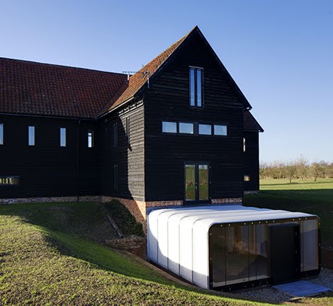
The AirClad extension is built in the ground where there was an underground pond discovered when the main barn was being built. For this reason the AirClad is in fact at ground level from outside and required a lot more pre preparation to the site before they could erect the AirClad. In fact this project required 80% to 20% in terms of site to AirClad. This would not normally be the case if they were not needing to tank the pod and build in underground water pumps for high rain fall dispersal. This project cost £25,000 to complete.


All the structures are waterproof and can withstand heavy rain, snow and wind. The air pressure within the structure repels the water away at the seams and allows it to run to the ground.


With AirClad you can integrate many other applications such as lighting, sound, A.C., storage and as you do, the product takes on an even greater sense of space and your personality. You can tailor this to your own personality.


AirClad is not limited to commercial and residential venues and they have designs ongoing for hotels, airport terminals, even a caravan park. More recently they've have been looking at humanitarian applications for disaster areas and war zones.


To learn more about their commercial structures, go here.

Nick Crosbie, Director
info@inflate.co.uk

Please donate

C'mon people, it's only a dollar.