google ad sense 728 x 90
Once Homes To Dolls, Now Modern Light Fixtures.
Artist Peter Waltz builds houses. But not the kind you live in, the kind you live with.
Peter has been working with found objects like Electrolux vacuums, old PA speakers, even hanging planter baskets, for many years, but it was his series of House Lights that captured my attention.
With a BFA from Tyler school of art in Philadelphia, Peter says he was always searching for items that can be transformed, reworked and renewed. Especially items that could serve as a vessel for light. Then came the houses.
"When I work with them, they tell a certain story about how they need to "remodeled". Whether it be maintaining the original paint, forcing them to rust, or polishing to a steel finish, they are all different. I guess these days I'm the only one in the country that can still "flip" a house." Peter writes, undoubtedly with a smile.
above: the artist, Peter Waltz, beneath one of his lights
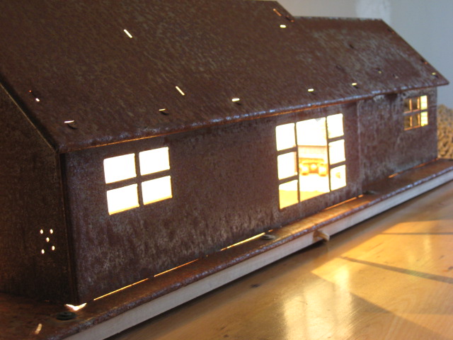
His House Lights, which can be wall mounted or used as table lamps, are mini mid-century suburban style vintage dollhouses. The ranch homes, two story homes or split level homes beg to be explored. With little patios, dormers, and multi pane windows they have the charm of a 'home sweet home' with the edginess of a modern art piece - and a functional one at that.
I believe some to be the actual tin litho homes by Marx, T. Cohn and Wolverine Supply & Mfg.Co which are shown below:
Below is a T. Cohn tin litho home as originally appeared and after Peter's treatment and wiring:
And with his process of forced rusting or polishing, he turns them into functional finds that cast beautiful shafts of light and shadow. Just take a look.
close ups and details:
Prices range from $300.00 to $700.00 USD. I suggest you buy one of his homes before you can't afford them. If still available, prices and more information can be found at Peter's site here.
special thanks to my modern met on notcot
10 Advertising Campaigns That Used Faces Made Of Art, Images Or Items.
It's not uncommon to see trends in the creative executions of advertising, but here's one that reached critical mass. The compositing of items to create human faces has been used in several different ad campaigns from reputable agencies all over the world.
I saw a post on Brainpickings.org via PicoCool about three campaigns that are visual tributes to music using this technique. It was then that I realized, I knew of several others, so I decided to do a round up of ten campaigns for you, not exclusively related to music.
Here are ten (now, just updated..so make that 11!) different ad campaigns (and one art project) all created within the past 3 years. Each of them is well-executed and very nicely art directed... but I think it's time to put a moratorium on assembled faces.
In the meantime, enjoy these:
1. The first is an art project by multimedia artist Iri5 who considers this her "Ghost In The Machine" series in which Robert Smith from The Cure, Jimmie Hendrix and Bob Dylan are all composed of cassette tape. Most impressive is that these are NOT photoshopped or painted but use a real cassette and tape.
2. The stunningly composed Grammy Ads (and accompanying tv spot) incorporate a concept by using the musicians favorite songs typographically to compose the image. Shown below are Coldplay, Thom Yorke and Lil' Wayne.
credits:
Agency: TBWA Chiat Day
Copywriter: Eric Arnold
Art direction and illustration: Steve Yee
3. These four Bose ads feature Elvis, Kishore Kumar (an Indian singer who resembles Wayne Newton), Madonna and Jim Morrison made up of black and grey silhouetted audio components.
credits:
Ad agency: Unknown
Art director: Nirmalya Chakraborty
Copywriter: Sanjeev Anand
4. The ads for RAM FM, a Jerusalem and Ramallah radio station known as Peace Radio, communicate the fact that the station brings people of different beliefs together via the use of passport stamps to comprise the visuals.
credits:
Advertising Agency: Gitam BBDO, Tel-Aviv, Israel
Art Director: Noam Laist
Copywriter: Orel Bitan
Studio: Ariel Vitkon, Elina Uretsky
5. One of my personal favorite executions are these stunning out of home posters and bus shelters, which make the faces of actual postage stamps, celebrating Finnish Stamps for the 150 year Jubilee Exhibition.
credits:
Advertising Agency: TBWA\PHS, Helsinki, Finland
Art Directors: Pia Pitkanen, Jukka Rosti
Illustrator: Pia Pitkanen
Copywriter: Erkko Mannila
6. An Argentina agency created these Nike Football ads out of little stamped footballs (or soccerballs for those of us in the States) as tributes to individual players.
credits:
Nike football: Aguero
Advertising Agency: BBDO, Buenos Aires, Argentina
Copywriter:Pablo Alvarez Travieso
Art Director:Gonzalo Vecino
7. These bus shelters for the Swedish furniture chain, IKEA, celebrate diversity by showing people of different ages and races all made up of the various product items available at IKEA.
credits: unknown
8. A nice attribute of this campaign for A Bela Sintra, a restaurant in Sao Paulo, is the varied state of the beans for the art, from full beans to finely ground, all make up the faces.
credits:
Advertising Agency: Giovanni + DraftFcb, Brazil
Art Director: Sidney Araújo
Copywriters: Alexandre Peralta, Astério Segundo
Illustrator: Marco D'Giorgio
9. Playing off the adage that "Music soothes the savage beast", this campaign for the Samsung i450 uses terrorists and dictators like Idi Amin and Osama Bin Laden to show how music in their heads can bring an end to fighting.
credits: unknown
10. And finally, an anti-smoking campaign from Unimed uses actual cigarettes to comprise the faces of such hateful characters as Hitler and Osama Bin Laden with the phrase "cigarettes kill more" is accompanied by an animated tv spot of 'war' signed off with "smoking kills more".
credits:
Advertising Agency: F/Nazca Saatchi & Saatchi, Brazil
Copywriters: Ricardo Jones, Eduardo Lima
Art Director: Airton Carmignani
LAST MINUTE UPDATE (forgot to add these!)
11. Another nicely constructed campaign, this one for Harley Davidson that uses tools and motorcycle parts to make up the visages.
credits:
Agency: Carmichael Lynch, Minneapolis, USA
Copywriter: Eric Sorensen
Art Director: Brock Davis
A big shout out to Ivan and his Ads Of The World where I was able to find many of the visuals and credits.
Isabelli Rossellini Has A Whale Of A Time With Green Porno 2!
I'm so happy to announce that Isabella Rossellini has created more of her fabulous Green Porno videos for The Sundance Channel (as I learned last night on the Late Late Show with Craig Ferguson).
above: Green Porno 1 had Isabella portraying the sex lives of insects
The first round of Green Porno videos, with the Italian beauty portraying lascivious insects, had me laughing so hard and yet simultaneously educated me, that I couldn't get enough of them.
This round, Green Porno 2, focuses on the sex lives of aquatic animals and has her portraying a limpet, a starfish, a whale, an angler fish and a barnacle - all while teaching us about their unusual reproductive systems and habits.
As a limpet:
As an Angler fish:
As a male Whale:
As a Starfish:
As a Barnacle:
Here are a few fun 'behind the scenes photos' as well as a "making of" video.
A lot of people deserve credit for this imaginative and educational series;
Isabella Rossellini (creator, producer, director, writer.. and of course, actress)
Jody Shapiro (co-director, producer, filmaker and photographer)
Rick Gilbert (producer, production designer and art director)
Andy Byers (production designer)
Sam Levy (director of photography)
and Claudio Campagna (scientific consultant)
the "Making Of" video:
To see all the Green Porno videos from the first and second rounds, go to the Green Sundance Channel here.
Pencil Sets by Melbourne Graffiti Artist Ghostpatrol
For someone who supposedly has a satirical black sense of humor, these pieces of artwork (which consist of assembled pencils, carved or cut to make the wood core a canvas and then painted upon) are some of the sweetest things I've ever seen. Framed as shown below, artist Ghostpatrol has created variations of these assemblages, using different types and colors of the pencils and numerous colored backgrounds on which they are mounted.
above: One of his pencil sets as framed
Ghostpatrol, a self-taught Melbourne artist who conceals his given birth name, is best know for his street graffiti, er.... urban art. But these assemblages, one of his other many talents, are beautiful little crafted pieces of whimsical narratives. Yes, some have dark subject matter, but it only makes them that much more appealing. And they are for sale, framed, if still available.
Here are just a few of them:
Prices for his pencil sets, framed and ready to hang, start at $1,950.00 USD. You can buy them here.
Ghostpatrol Bio:
Born In Hobart, Australia
Works and lives in Melbourne Australia
A self taught illustrator. Ghostpatrol has moved from the field of stencil art to exhibit his illustration based work worldwide. He currently resides in Melbourne at his ‘Mitten Fortress’ studio. His work ranges form fine ink drawing, graffiti, commissioned murals and soft sculpture.
above: one example of Ghostpatrol's street art
You can’t describe Ghostpatrol in one paragraph. Over a couple of years of the most regular contact I have had with any graffiti writer GP is as hard to truly understand now as on day one.
Incredibly innovative and driven by creative impulses, with an infinite injection of energy, GP will always surprise. He sculpts, paints, draws and sews. GP works with whatever media he can find or afford to purchase including but not limited to spray cans, paper, pens, markers, wood, clay and so on. He has so many fingers in different creative pies he could be an octopus.
above: Ghostpatrol
His pen and ink drawings are delicate, rapidly produced and yet are meticulous in their detail and always bordering on the darker side of our nature. Conversely his large paste-ups are simple in design, but highly effective in capturing your attention.
He has a deep-seated sense of the ironic, and an almost black satirical humour – the monthly hard-rubbish collections are dotted with his anecdotal commentaries. Not noted for sculpture at this stage of his development, GP will for sure venture into this arena also, and when he does he will sculpt big. Ghostpatrol in a few words – dark, moody, energetic and passionate. He knows what he wants and he knows how to realise his dreams. -Matthew Lunn (author of Street Art Uncut)
ghostpatrol.net
Subscribe to:
Posts (Atom)
Please donate
C'mon people, it's only a dollar.