google ad sense 728 x 90

The Urban Appeal Of Steven Albert's Photo-Realism Paintings


above: Stroll by Steven Albert, oil on canvas, 30" x 40", Hespe gallery

Steven Albert's oil paintings are hyperrealistic representations of urban and small town icons like cafes, coffeehouses, street windows, graffiti scrawled walls and parked cars. The mundane subject matter is executed with a deft hand, keen eye and romantic familiarity, especially to those who grew up around San Francisco.


above: 1789 Folsom by Steven Albert, 2009, oil on canvas, 30"X48", George Billis Gallery, New York

Reminiscent of the hyper realistic paintings by Robert Bechtle and Richard Estes, Alberts' work catapults us into present day venues with the graffiti and street art not apparent decades ago when Bechtle was immortalizing suburbia or in hyperrealism paintings of Stephen Magsig's Michigan.

2 ecampes of Richard Estes paintings:


2 examples of Robert Bechtle's paintings:


In Steven Albert's work, the audience's relationship to the paintings and their subject matter depends up the viewers position in relation to the scene. At times you are a voyeur peering into the crowded cafes and the patrons within, separated by doors or windows, such as in the following pieces:

Straight Through:

Blue Door:
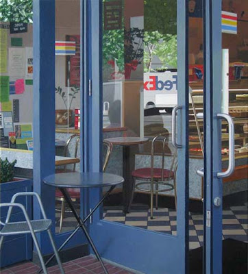
Trinity:

Window On Market:

The Park:

Royal Grouds:

Benedictine:

All Nighter:

Evening At The Allstar:

Key Lime:


At other times, you are within the establishment, often empty and laden with a quiet calm inside as you witness the action outside, separately only by plate glass windows:

24th Street Pops:

Interstices:

Get up:

Jump:

Orange Retro:

And still, in other pieces you are a distant witness to surroundings you might often have overlooked or grown anesthetized to unless you saw them imortalized on canvas, as in the following works:

1780 folsom:

On Fire:

Moving:

Graffiti Series IV:

Blue Girlies:

Stroll:

Swirl:


Artist bio:
From the forests of Northern Maine, where he was raised,to the streets of San Francisco, Steven Albert's paintings have always been informed by patterns of clear, bright sunlight and shadows.

Although architectural designs dominate his imagery, doors and windows are often the focus, creating a sense of portal into often missed aspects of our concrete reality, whether it be rooms of mysterious and zen-like calm, or the fractured and frenetic multiplicity of urban cafes and storefronts. Albert seeks to highlight the small moments, common in our lives, but often unexperienced.

Albert's work is represented by galleries in Los Angeles, San Francisco, and New York and has been exhibted in various museums and venues around the country. His paintings are included in several important collections worldwide. In 2006, he was awarded a Pollack-Krasner Foundation grant.


Artist's Statement:
In my paintings, I begin by discovering and drawing out abstract, linear and spatial order from the seemingly random activity of commonplace situations, such as those found sitting in or walking by cafes and restaurants where so many elements of normal life converge. Architectural elements are used as a sort of scaffolding to frame, and fracture the picture plane and illusionistic spaces, creating something of a kaleidoscopic collage.

Objects and events like interior/exterior, people, streets, cars, tables, chairs, cups, napkins and trees, are held together by a unifying, realistic rendering and warm, bright light, shadows, and reflections luring us in.

With no object or figure deemed more central or more important than any other, the paintings are subject-less and decentralized, seemingly expanding beyond the confines of the canvas. The final images compel, disquiet and reassure. Comfortable inviting moments are answered with jarring complexity, and sometimes confusion.

They are still, silent, possibly ambiguous, yet frenetic, complicated and active. They are without emotional or narrative context, moral or politic. They are also without existential probing and anxiety. Viewers may decide to impart such meaning depending on their own personal experiences and reactions. Instead, the paintings are distillations and attempts at acceptance of the ever changing and ungraspable and inescapable and unedited "now", brimming with imminent and potential energy. They delight is simply being "slices of life," stumbled upon and easily missed, inviting contemplation of the moments and structure within our surroundings.

Steven D. Albert
ph: (415)-225-2960
sdalbert2@gmail.com

KOPLIN DEL RIO GALLERY
6031 Washington Blvd.
Los Angeles, CA 90232
ph: (310)-836-9055
www.koplindelrio.com

HESPE GALLERY
251 Post Street , Suite 420
San Francisco, CA 94108
ph: (415)-776-5918
www.hespe.com

GEORGE BILLIS GALLERY
511 West 25th Street, Ground Floor
New York, NY 10001
ph: (212)-645-2621
www.georgebillis.com

Newcastle Brown Ale Invites You To Design Your Own Label


above: six examples of submissions to the contest

Newcastle Brown Ale, America’s No. 1 imported ale, recently announced the launch of its “Your Beer. Your Label.” program. Aimed at celebrating the personality of its fans, Newcastle is turning its label into a blank canvas for adult consumers to change their individual bottles into a one-of-a-kind artistic expression. Consumers may use any type of tool – pencil, paint or computer – to create their unique label.


Digital labels submitted through the microsite will be considered during the designer search, with the chosen concept featured prominently on the Newcastle Brown Ale Web site.


above: the actual Newcastle Brown Ale label

“The Newcastle logo, with its unusual ‘cottage loaf’ shape and its iconic blue star, has inspired hundreds of photo collages and tattoo designs. We’re encouraging Newcastle drinkers to tailor individual labels with their own uniquely different, personalized touches,” said Colin Westcott-Pitt, Brand Director, Newcastle Brown Ale. “Our online program gives fans a chance to show off their artistic skills and, for one designer, on our Web site. We expect our judging panel will be inspired by the variety of designs our fans will submit.”

For designs to be considered, U.S. consumers 21 and older must submit their digital concepts on NewcastleBrown.com before March 14, 2010. After the entry period, fans are encouraged to vote for their favorite design until March 30, 2010.

The 10 designs with the largest number of votes will be judged by Newcastle team members on the basis of creativity, originality and brand personality. The selected designer will have their label prominently showcased on Newcastle’s Web site.


For additional rules, a template to download or just to get started, please visit here


The Making Of Chanel's New Venetian Bib Necklace


I'm very fond of the 2009/2010 CHANEL Cruise collection (as opposed to their Spring 2010 haute couture collection) and the accompanying accessories.

The large decorative bejeweled neck pieces referred to as plastrons, are a stunning accessory to the line.


Here's how they created the beautiful plastron, a Venetian bib necklace with resin and cast stones that is part of their Cruise 2009/2010 collection of jewels, shown above and below:


above photo by Karl Lagerfeld

A resin shaft, made in advance, serves as a model for the parts of the necklace:


The glass rods are heated with a torch:


The glass is then poured into each piece of the necklace according to the studio sketch:


The imprint of the chamber is made in a silicone mold. All of the pieces are then gilded in "galva", an acid that enables the gilding of pewter and iron:


The backs of the pieces of the necklace are polished in order to obtain an 'aged' effect, with a sparkling resin. Then, all the pieces of the necklace are joined with solder:


The heart at the center of the chamber is drawn using a syringe filled with red enamel:


and voila!

all images courtesy of Chanel

Glass Wall Design Televisions From Plush Department


New at Plush Department of Amsterdam (the same company about whose fabulous ceramic glazed computers I wrote about here) are these high end modular and wall mount flush glass television screens.

One of the biggest challenges for Plush Department was the perfect integration of the visual interface. Often, tv screens are a disruption of the interior, so they looked at a variety of possible solutions and decided on glass as the perfect material.

The screens are seamlessly integrated into the design while maintaining the highest possible image quality.


above: the 200cm x 140cm white basic module

above: 175cm x 140cm white wall mount module

above: the 200cm x 140cm black basic module

The Modular Glass Television by Plush Department is a High Definition television of the highest grade with superior image quality and the best possible color representation and sharpness.

The television is mounted behind glass on the wall. Once switched off, the black image area turns into a mirror. The set integrates beautifully into the interior design.

You can use one or more modules. If you use several modules the center module contains the television. Of course you can also use several modules each containing a television.


above: 200cm x 140cm black basic module

You can choose between white and black or request special colors. In the near future they intend to extend the line with furniture modules by well known designers.


Plush Department is a division of MR Silent Computing
Dukdalfweg 30
1041BE Amsterdam - Nederland
Tel. +31-(0)20 33 01 345
Email: info@plushdepartment.com


Another way to 'conceal' a modern television are these wonderful Two Eye TV's, the R4.

Tord Boontje Designs For The HP Mini


Play a game of hide and seek with over 30 endangered creatures on the limited edition HP Mini by Studio Tord Boontje. Inspired by harmony in nature and designed by world-renowned industrial designer Tord Boontje, it is intricately crafted using HP Imprint 3D, a world’s first in 3D surface technology.


The Partnership


World-renowned industrial designer, Tord Boontje, is a recipient of multiple prestigious design awards and many of his pieces are displayed in museums around the world. HP and Tord both share a common philosophy – to be socially and environmentally responsible, and to influence others in doing the same.

The Design- A World's First


This exclusive HP Imprint 3D finish is beautifully adorned with flora that weaves delicately around endangered animals, creating a mystical, layered effect.


A closer look reveals shy animals hiding delicately within the flora – like taking a walk in the woods and discovering animals along the way. But these are no ordinary animals – many are endangered animals such as the polar bear, the blue whale, the red squirrel – just a few of the many creatures relying on us to help sustain the world that we share.

Make smarter choices for the environment


This HP Mini features a 10.1-inch mercury-free LED backlit display for increased energy efficiency. With packaging and user guides that are made 100% from recycled materials and printed with soy-based ink, you can now play your part for the environment.

Personalise


Awaken your senses and enjoy wallpapers and special icons* designed by Tord Boontje, plus a customised Stardock MyColors™* desktop theme for a truly personal experience. Matching accessories are also available separately:


Easy access, easy sync


Gain fast access to the Internet with HP QuickWeb#, even without booting up. Instantly sync all your favourite music, video and files via HP QuickSync.
Buy The HP Mini 110-1135NR by Studio Tord Boontje

Please donate

C'mon people, it's only a dollar.