The second season of the HBO series Game Of Thrones has begun and each time I watch it, I am mesmerized by the opening title sequence. I wanted to share it with my readers and in doing so, came across two wonderful articles I'm cobbling together.
The first is an article on The Hollywood Reporter which features an interview with Angus Wall, who designed the sequence and titles (and long ago, in another lifetime, worked with me as the editor on one of my tv commercials). You may recognize his name from winning Oscars for editing both The Social Network (2010) and The Girl With The Dragon Tattoo (2011).
The other, an impressively comprehensive post from Art of The Title, features another interview with Angus Wall as well as wonderful concept sketches and renderings for the opening sequence that I've shown in this post.
The Hollywood Reporter sat down with the talented Wall last year to ask him how he came up with the idea, what it means and how it was executed. Below is a reprint of that interview with added interspersed images from the Art of The Title article:
Angus Wall of the company Elastic got Emmy noms for Big Love's and Rome's title design and a win for Carnivale, plus a Social Network editing Oscar. But what's hotter now is his genius opening title sequence for HBO's critical smash Game of Thrones. HBO wanted something like the map that begins books like The Lord of the Rings. "We wanted to do something different from the standard tropes for fantasy maps," Wall tells THR. "So we came up with the idea of a world inside a sphere."
The sphere idea came from a '60s sci-fi space station with terrain inside -- yet it had to look nonfuturistic, to evoke the Middle Earth-ish setting of George R.R. Martin's book. "It had to look like it was made in that time, so we immediately referenced Leonardo da Vinci's machines," says Wall. "We wanted it to look like a real place photographed with a real camera."
The computer-illusion "camera" swoops from kingdom to kingdom, focusing on the family crest that sits atop each place -- the "sigil." "The sigil becomes the main cog that triggers the animation" -- the da Vinci device, full of interlocking cogs. "So the model of the place emerges out of the floor of the map and comes to life." Like the show itself, the title sequence strives for realism within a fantasy setting. "In the shadowed areas beneath the surface of the map, there are cogs in there. If you look carefully, you'll see they're all working with the cogs that are exposed above the surface of the map."
The six Sigils (or family crests):
And is this cog-filled da Vinci war engine a metaphor for the many hidden, interlocking machinations of the show's families fighting for the throne -- the Houses of Lannister, Baratheon, and Stark? "Absolutely!" says Wall. "And the map reflects the attitude of each place. Winterfell is a lot more rustic." Kind of like the Shire in Tolkien? "Yes. And each place has its own climate. Southern Westeros is more temperate.To the East, Essos is almost Mediterranean. As you go north, Winterfell gets harsher, and further north, The Wall is a continent-wide wall of ice."
The Wall:
Winterfell sketch and final rendering:
Castleblack sketch and rendering:
Gotswood sketches:
Port city of Pentos:
If you watch the title sequence attentively, you'll see the the feuding families' backstory told in pictures. "In the middle of the sphere there's the sun, and in the middle of the sun there are bands around it, relief sculptures on an astrolabe which tell the legend of the land," explains Wall. "We cut to those three times in the title sequence, so you actually see a history of Westeros and Essos. The third time we see all the animals [representing] the different houses bowing down to the Baratheon stag, which brings us to the present, where there's a Baratheon king [played by Mark Addy]."
The Astrolabe rendering and final:
Got that? George R.R. Martin's 15 million readers are likelier to get it than casual viewers. Wall is bowing down to them, the way he bowed to scholars when he made the Rome opening titles, which were full of authentic graffiti from ancient Rome. "We wanted to be very, very faithful to the book because we knew there would be a large fan base that will be looking at this very carefully," says Wall. In The New Yorker, Laura Miller writes that angry Martin fans call themselves "GRRuMblers," and Martin tells her, "If I f--- it up...they'll come after me with pitchforks and torches."
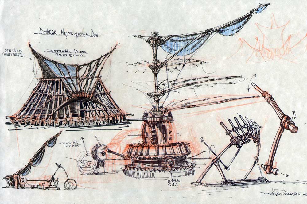
Dothrak sketches:
Even if you're a peaceable newcomer to Westeros carrying no torch for Martin, Wall thinks the title credits will help you get oriented. "It's not necessarily important that the audience explicitly understands every detail at first. But you always have a sense that there is an internal logic. Title sequences are a weird art -- to function, they have to have that logic -- their own clockwork, as it were."
Eyrie sketches and rendering:
"It's a map that's constantly evolving," says Wall. "We have four different versions. Episode two has a different title sequence, and there are later episodes where we go to two new locations -- The Eyrie and The Twins." But Wall won't say what clockwork wonders await you there. "Those are treats to come." The two-year Thrones experience was a treat for him. "It's one of the most fun projects I've ever worked on." - Hollywood Reporter
And for those interested in a more in depth interview and explanation, be sure to read this article on Art of the Title.
In the process of writing this post I came across this hilarious take-off on the Game Of Thrones opening sequence for The Simpsons, which is definitely worth including.
As Adam Fraser reports on Nokia's conversations blog "Arm eight filmmakers with two Nokia N8s each, a $5,000 budget and ask them to produce a short film within a few weeks and what do you get? A bunch of amazing mini-movies, that’s what. However, there can only be one that wins the top prize of $10,000 USD. That award goes to JW Griffiths, for his movie – Splitscreen. You can see it below.
Love. It’s been the subject of many a movie since the dawn of, well, movies. Splitscreen is about two people falling in love who come from different parts of the world. Using two perspectives at once on the same screen, we’re able to follow each person’s journey through life as they embark on a journey to foreign lands, only to bump into each other half-way across the River Thames on Golden Jubilee Bridge."
Here’s the winning short film, Splitscreen, Shot entirely on the Nokia N8 mobile phone.
Director: James W Griffiths Producer: Kurban Kassam Director of Photography: Christopher Moon Editor: Marianne Kuopanportti Sound Design: Mauricio d'Orey Music composed by: Lennert Busch
You may have seen this modern concrete and wood structure, with it's living roof, referred to as the Seashell-Inspired House or The Abalone House. The unusual modern home (it's really just a small beach house) in Big Sur, California has been recently featured, with few images, on several blogs (trendir, designyoutrust and inthralld for example) and Pinterest, even though it was completed four years ago.
The above two images are from unknown source. If you know who to credit, please tell me.
It's no wonder it's difficult to find more images and information about this modern structure (which is only 775 square feet). The Carmel, CA architect, Thomas Cowen, has no website. The landscaping company from which the images in the aforementioned blogs were procured did not credit the photographer and they misspelled the name of the building contractor in their credits. But with some serious research, I have uncovered several more images of and information about the home I have yet to see on any blogs or architecture sites and am excited to share them with you.
Rana Creek the landscaping company who designed the living roof calls it the Abalone House.
The glass skylight you see on the roof of the structure is actually above an interior shower:
From the aerial image of the property below, you can see how it's been termed the Seashell-Inspired house because it's more of a Nautilus than an Abalone.
It's set on a private road (9525 Pias Ranch Road), just off the bluff, south of Sycamore Canyon Road and the owners of the home are venture capitalist Alex Balkanski of Benchmark Capital and wife Sybilla.
Below are images of the circular structure and its interior, complete with concrete walls, wood beam ceiling and curved cabinetry:
The spiral shaped concrete structure was actually a second floor addition to a three bedroom three bathroom single-family dwelling totaling 775 square feet. And according to the approved development permit for the Balkanskis (PLN040665/Balkanski), it also was intended to have a detached 575 square foot underground wine cellar, a 120 sq. ft. mechanical room, a 375 sq. ft. pool and spa with a retaining wall and deck. Whether or not these were all completed, I do not know.
Completed: 2008
Client/ Owners: Alex & Sybilla Balkanski
Location: Big Sur, California
Architect: Thomas Cowen
Contractor: Kevin Rider, Rider Construction