A few weeks ago I introduced you to Stitchtagram, a way to have your Instagram photos turned into handmade throw pillows. Now, more companies are capitalizing on the popularity of the free app.
above: Instagram is a free app that adds preset filters to your mobile phone photos
Stickygram turns your images into magnets while Printstagram turns them into little stickers (I know, the names are confusing and would make more sense if inverted).
What is Prinstagram?
Mini Stickers made from your Instagram photos. You get 252 stickers per order. Two sticker books per order with a total of 252 stickers. Each sticker is 20mm square (0.8 inches) Get Your Printstagram stickers here
What is StickyGram?
StickyGram turns your Instagram images into little magnets. You create your pack online and they deliver them to your door.
Each StickyGram is 50mm x 50mm (that’s approximately the same size as they appear on your iPhone) and they come in packs of 9. Get your StickyGrams here
Another Instagram Goodie:
Don't forget you can turn your Instagram photos into beautiful books as well at Blurb.
The second season of the HBO series Game Of Thrones has begun and each time I watch it, I am mesmerized by the opening title sequence. I wanted to share it with my readers and in doing so, came across two wonderful articles I'm cobbling together.
The first is an article on The Hollywood Reporter which features an interview with Angus Wall, who designed the sequence and titles (and long ago, in another lifetime, worked with me as the editor on one of my tv commercials). You may recognize his name from winning Oscars for editing both The Social Network (2010) and The Girl With The Dragon Tattoo (2011).
The other, an impressively comprehensive post from Art of The Title, features another interview with Angus Wall as well as wonderful concept sketches and renderings for the opening sequence that I've shown in this post.
The Hollywood Reporter sat down with the talented Wall last year to ask him how he came up with the idea, what it means and how it was executed. Below is a reprint of that interview with added interspersed images from the Art of The Title article:
Angus Wall of the company Elastic got Emmy noms for Big Love's and Rome's title design and a win for Carnivale, plus a Social Network editing Oscar. But what's hotter now is his genius opening title sequence for HBO's critical smash Game of Thrones. HBO wanted something like the map that begins books like The Lord of the Rings. "We wanted to do something different from the standard tropes for fantasy maps," Wall tells THR. "So we came up with the idea of a world inside a sphere."
The sphere idea came from a '60s sci-fi space station with terrain inside -- yet it had to look nonfuturistic, to evoke the Middle Earth-ish setting of George R.R. Martin's book. "It had to look like it was made in that time, so we immediately referenced Leonardo da Vinci's machines," says Wall. "We wanted it to look like a real place photographed with a real camera."
The computer-illusion "camera" swoops from kingdom to kingdom, focusing on the family crest that sits atop each place -- the "sigil." "The sigil becomes the main cog that triggers the animation" -- the da Vinci device, full of interlocking cogs. "So the model of the place emerges out of the floor of the map and comes to life." Like the show itself, the title sequence strives for realism within a fantasy setting. "In the shadowed areas beneath the surface of the map, there are cogs in there. If you look carefully, you'll see they're all working with the cogs that are exposed above the surface of the map."
The six Sigils (or family crests):
And is this cog-filled da Vinci war engine a metaphor for the many hidden, interlocking machinations of the show's families fighting for the throne -- the Houses of Lannister, Baratheon, and Stark? "Absolutely!" says Wall. "And the map reflects the attitude of each place. Winterfell is a lot more rustic." Kind of like the Shire in Tolkien? "Yes. And each place has its own climate. Southern Westeros is more temperate.To the East, Essos is almost Mediterranean. As you go north, Winterfell gets harsher, and further north, The Wall is a continent-wide wall of ice."
The Wall:
Winterfell sketch and final rendering:
Castleblack sketch and rendering:
Gotswood sketches:
Port city of Pentos:
If you watch the title sequence attentively, you'll see the the feuding families' backstory told in pictures. "In the middle of the sphere there's the sun, and in the middle of the sun there are bands around it, relief sculptures on an astrolabe which tell the legend of the land," explains Wall. "We cut to those three times in the title sequence, so you actually see a history of Westeros and Essos. The third time we see all the animals [representing] the different houses bowing down to the Baratheon stag, which brings us to the present, where there's a Baratheon king [played by Mark Addy]."
The Astrolabe rendering and final:
Got that? George R.R. Martin's 15 million readers are likelier to get it than casual viewers. Wall is bowing down to them, the way he bowed to scholars when he made the Rome opening titles, which were full of authentic graffiti from ancient Rome. "We wanted to be very, very faithful to the book because we knew there would be a large fan base that will be looking at this very carefully," says Wall. In The New Yorker, Laura Miller writes that angry Martin fans call themselves "GRRuMblers," and Martin tells her, "If I f--- it up...they'll come after me with pitchforks and torches."
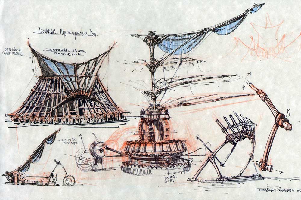
Dothrak sketches:
Even if you're a peaceable newcomer to Westeros carrying no torch for Martin, Wall thinks the title credits will help you get oriented. "It's not necessarily important that the audience explicitly understands every detail at first. But you always have a sense that there is an internal logic. Title sequences are a weird art -- to function, they have to have that logic -- their own clockwork, as it were."
Eyrie sketches and rendering:
"It's a map that's constantly evolving," says Wall. "We have four different versions. Episode two has a different title sequence, and there are later episodes where we go to two new locations -- The Eyrie and The Twins." But Wall won't say what clockwork wonders await you there. "Those are treats to come." The two-year Thrones experience was a treat for him. "It's one of the most fun projects I've ever worked on." - Hollywood Reporter
And for those interested in a more in depth interview and explanation, be sure to read this article on Art of the Title.
In the process of writing this post I came across this hilarious take-off on the Game Of Thrones opening sequence for The Simpsons, which is definitely worth including.
David Trautrimas, the Canadian artist about whose steampunk-like architectural art, The Habitat Machines, I blogged about once before, has a wonderful new series of work called The Spyfrost Project. The Spyfrost Project illustrates David's hypothesizing the origins of modern iconic appliances by reassembling them into top secret Cold War era military outposts. These hybrids of machinery and architecture stand as colossal weaponized ancestors to common objects, such as refrigerators, lawnmowers and washing machines.
Carbon Inversion Device:
detail:
Digital print on archival paper (framed). 30” x 20”. 2010. Edition of 14. $1400.00 each.
Micro Re-Instigator:
detail:
Digital print on archival paper (framed). 40” x 30”. 2010. Edition of 10. $2600.00 each.
Mnemonic Doppelganger:
detail:
Digital print on archival paper (framed). 22.5” x 35”. 2010. Edition of 12. $1725.00 each.
Seismic Conduction Tower (and detail):
Digital print on archival paper (framed). 20” x 30”. 2010. Edition of 14. $1400.00 each.
Storm Crown Mechanism:
detail:
Digital print on archival paper (framed). 40” x 30”. 2010. Edition of 10. $2600.00 each.
Terra Thermal Inducer:
detail:
Digital print on archival paper (framed). 35” x 22.5”. 2010. Edition of 12. $1725.00 each.
The Aurora Maker (and detail):
Digital print on archival paper (framed). 14” x 17”. 2010. Edition of 16. $925.00 each.
The Brilliant Device:
detail:
Digital print on archival paper (framed). 30” x 20”. 2010. Edition of 14. $1400.00 each.
The Fragment Accumulator (and detail):
Digital print on archival paper (framed). 20” x 30”. 2010. Edition of 14. $1400.00 each.
The Radiant Proliferator:
Digital print on archival paper (framed). 30” x 20”. 2010. Edition of 14. $1400.00 each.
The Toronto launch of his latest series will be opening at LE Gallery on Friday April 30th and the exhibition runs from April 28th to May 30th. In Europe, The Spyfrost Series will be exhibited at the Eckhart Gallery in The Hague, Netherlands from May 2nd to June 11th.