google ad sense 728 x 90

Laurina Paperina's How To Kill The Artists


Meet Laura Scottini (aka Laurina Paperina), an italian artist with a wonderfully wicked sense of humor.


Her collection of drawings, installation and videos in the exhibit "How To Kill The Artists" is a hilarous and purposely ironic twist in which contemporary artists and cartoonists are being attacked by objects of their own creation, most of which brought them great wealth and or fame. I have gone to to trouble to locate images of the original pieces of art which Laurina references because some of you may not be familiar with the artists or the works.

The Installation:


Now, to better understand the following drawings, I have attached the artist's originals below Laurina's drawings/paintings so you can fully appreciate the satire.


Above: Paperina's painting with all the 'artists' from her collection


Jeff Koons:

Above: Paperina's Jeff Koons Vs His Dog

above: Koons' Balloon Puppy

Keith Haring:

Above: Paperina's Keith Haring's Dog.
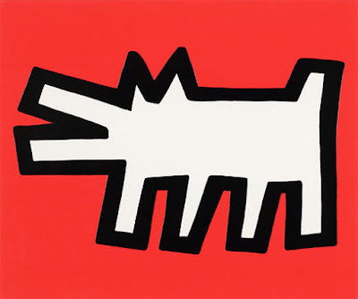
Above : keith haring's famous dog icon

Joseph Beuys:

Above: Paperina's Joseph Beuys Eaten By Wolf.

Above: Joseph Beuys and Coyote, performance piece

Jackson Pollock:

Above: Paperina's Pollock

Above: Jackson Pollock at work

David Shrigley:

Above : Paperina's David Shrigley

Above: David Shrigley's photo "severed hand"

Maurizio Cattelan:

Above: Paperina's Cattalan Does Not Surf

Above: Maurizio Cattelan's Charlie Don't Surf

Barry McGee:

Above: Barry McGee (aka Twist)

Above: Barry McGee Sprayed

Above: Graffiti artist Barry McGee (aka Twist) at work

Takeshi Murakami:

Above: Paperina's Murakami Vs DOB

Above: Takeshi Murakami's DOB

Andy Warhol:

Above: Paperina's Warhol Vs. Marilyn

Above: Andy Warhol's Marilyn screenprint

Frida Kahlo:

Above: Paperina's Frida Kahlo

Above: Frida Kahlo's Self Portrait as the Little Deer

Jean Michel Basquiat:

Above: Paperina's Basquiat Vs. His Monster

Above: Jean Michel Basquiat, untitled

Above: Although not ready for download quite yet, she has animated videos which will be available for viewing on her site.

More about the artist:

Laurina Paperina (in english "Little Laura - Little Duck")
1980, Born in Rovereto. She lives and works between Mori (Trento, Italy) and Duck Land
2005, Academy of Fine Arts, Verona, Italy
1999, Art Institute, Rovereto (Trento), Italy

The artists' statement (in italian followed by english):

Io gioco con l'arte.
Il mio lavoro è un'elaborazione ironica della contemporaneità e sulle identità che la compongono. Elaborazione che nasce sintetizzando un linguaggio dove diversità e contraddizione si compenetrano e dove l'influenza dalla cultura di internet e della tv, dei fumetti e dei video games, della fantascienza e dei cartoons, generano un complesso insieme di elementi che si trasformano in un apparente caos ma lasciano intravedere delle forme riconoscibili.
I personaggi che popolano i miei lavori sono dunque ironia dipinta e sono frutto della mia fantasia, sono forme dinamiche e colori sgargianti di una sorta di "virtual reality" simile ad un video games dove la finzione e l'apparenza giocano simulando la realtà.
In sintesi il mio lavoro è un gioco ironico sulle sue esperienze che non ha un fine ben preciso se non quello di rappresentare le diversità di pensiero e come queste possano coesistere,
come se ogni elemento fosse un frammento indispensabile di un puzzle.

[I'm sorry...my english isn't good !!!]

I play with art. My work is an ironic elaboration of contemporaneity and the elements which are part of it. It is an elaboration stemming from a language sysnthesis where diversity and contradiction are intertwined and where the influence of internet culture, TV, comic strips, video games, sci-fi and cartoons are generating a complex set of elements, which, although turning into an apparent chaos, are letting themselves be seen in recognizable forms.
Characters populating my works are "painted irony": they are the fruits of my fantasy, dynamic forms and flamboyant colors of some sort of virtual reality resembling a video game where fiction and appearance interplay and simulate reality.
In sum, my work is an ironic game on my experiences, which has no specific purpose but to represent divergencies of thought and the way such divergencies may coexist, as though each element were an indespensable fragment of a jigsaw-puzzle.
Visit her site and see much of her other work.

Product Pick Of The Week: Mirabilia Range Hoods


The MIRABILIA line of kitchen hoods from Falmec.

above: the Manhattan

The line is composed of two versions, Oval or Rectangular. Made of decorated glass and with a light, it's more than a hood for your range or stove, it's a functional design element that provides light as well as ventilation.


above: the Comet

above: the Elektra

above: the Zebra

above: the Natura Gold

above: the Ice

Both designs are available in plain white frosted glass as seen below:


All the designs have very easy access to changing the bulbs:

as well as nicely designed electronic control panels:


Falmec S.p.A.
Via dell'Artigianato, 42
31029 Vittorio Veneto TV - ITALIA
Telefono 0438 5025 - Fax 0438 501531

Go here to purchase or for more information.

Moleskine Notebooks Get Even More Hip With 'Engrave Your Book'


Engrave your book sells a series of artist designed laser engraved Moleskine notebooks or gives you the option to design your own, making the favorite notebook of artists and designers that much more hip.


Below are some selections from their artist series:


..and some examples of custom covers:


Choose from a wonderful series of artist designed covers or upload your art or photo and make your own!
Click here.

And they do the same with laptops, check out Engrave your tech.

Is It A "W"? A New Ian Schrager Hotel? Nope, It's Motel 6


Motel 6 Hips Up With a New "Phoenix" Prototype Hotel with rooms designed by Priestman Goode and exterior designed by Boka Powell.

Phoenix Design Combines Modern Style, Functionality and Value

Motel 6, known for offering a clean, comfortable room for the lowest price of any national chain, is reinventing the economy lodging experience with the announcement of its first new prototype in 12 years. Accor North America, one of the nation’s largest hotel owner/operators and the parent company of Motel 6, today unveiled the Motel 6 “Phoenix” prototype.


The Phoenix prototype, named after the mythical bird symbolizing rebirth and renewal, signifies the reinvention of Motel 6 and the re-establishing of its position as the uncontested leader in price value in the economy segment. True to the spirit of Motel 6, the new design is simple, functional and straight to the point.

Priestman Goode of London designed the room (after winning a competition and with input from guests and franchisees) to optimize the use of space by combining multiple functions into a single piece of furniture to provide modern functionality.


Major features of the Phoenix prototype include a new building exterior designed by BOKA Powell,(who designed accor's headquarters in texas) a spacious lobby with a new 24-hour food and beverage vending market place, and a modern guestroom design that features bright accent colors. The room includes ambient lighting, wood-effect flooring rather than carpet, and a 32-inch flat-screen TV. The flat screen TV is displayed on the entertainment unit which conceals the door-less wardrobe behind it, thus combining two needs into one unit.


Also included on the entertainment unit is a cubby for personal items and a multi-media panel allowing guests to plug in their mp3 players, CD players and laptop computers – this feature allows guests to listen to their favorite tunes or use the flat-screen TV as their computer monitor while enjoying Wi-Fi internet access in their room. The room also features pedestal beds with a new taupe-colored coverlet and pillow-top platform mattress.


Above: The “table for two” is situated in the corner of the room with a design that encourages and allows for interaction between guests, whether during meals, discussions or games.


Above: The bathroom features double doors, black granite counter top with a vessel/raised sink and a walk-in shower that includes a molded seat for comfort and convenience. The bathroom features a large vanity area with a bright decorative towel cubby on the wall that adds extra accent lighting.

Upon entering the room the guest is greeted by a short corridor, leading into the open space of the room. The bathroom is situated off of the entrance corridor, and for added privacy all of its elements are separate from the rest of the room. The feel of the bedroom is bright and airy due in large part to the minimal furniture that, by design, seems to float in the space. The pedestal bed allows for storage of luggage under the bed and allows for easy cleaning access and visibility.

“This design embodies the heart of Motel 6 – it’s no-frills, uncomplicated and efficient with a new modern edge,” said Jim Amorosia, president and COO of Motel 6 and Studio 6. “The Phoenix prototype offers the best of both worlds - an upscale feel at the lowest price of any national chain.”


Above: Boka Powell's offices for Accor's headquarters in Texas.

After a design competition, the Phoenix prototype design by Priestman Goode was chosen based on input from franchisees and guests. The first Phoenix prototype will be a corporate-owned location, and construction will begin in the latter half of 2008. The new prototype will be available to franchisees in the summer of 2009. Future plans call for many current Motel 6 corporate properties to be retrofitted with elements of the new prototype.

Motel 6 rooms over the years:


Visit the Motel 6 site here

Please donate

C'mon people, it's only a dollar.