This new 4,800 square meter hotel in Panang, Malaysia was just completed last year and has already garnered numerous awards from the most prestigious hotel and travel organizations. It is housed in a 100 year old historic mansion that has been adapted into a modern and hip, but luxurious dining room, living room, den, cellar (bar), lawn area, mosaic pool and 8 separate rooms complete with private baths.

The name Macalister Mansion honors Panang's British Governor Colonel Norman Macalister and there are numerous references to him in a host of specially commissioned art pieces found in and on the grounds of the mansion.

Designed and branded as a lifestyle oriented 'residence', the Macalister Mansion and the five F&B (food and beverage) and Hotel entities (rooms) that comprise it have been conceived as a single holistic vision by the
Ministry of Design based in Singapore.


Led by its Design Director Colin Seah, the design differentiates itself from the local boutique hotel scene by its intimate scale, contemporary design and attention to details - design ranging from art curation to uniforms, branding to interior design and everything else in between.
Wall sketches in the livingroom, art in the bedrooms and whimsical animal sculptures permeate the hotel:


Set against the backdrop of a conserved mansion, the heritage spaces have been carefully adapted and key features conserved and infused with contemporary design, allowing the project to strike a balance between the nostalgia of the past and a vision of relevance for the future.

When Colin was first approached by the client Dato' Sean to conceive of a lifestyle based offering which would enliven the hotel and dining scene in Penang, it was readily agreed that the new offering in the restored colonial mansion would stem from a holistic vision, with the 8 rooms and the 5 F&Bs (formal diningroom, casual dining, the den, the cellar and the outdoor bar) forming a holistic brand with a distinctive positioning.


The design process spanned an 8 month period from February to September 2011, with Colin and Dato' Sean working collaboratively to produce a design for a stunning set of distinct entities offering sophistication in a singular package.
In the 12 months of construction that followed, there were multiple meetings held to discuss the major infrastructural work required to restore a colonial mansion, e.g. retaining and reinforcing original columns, staircases and archways, removing plaster to reveal the original brick walls and wall cornices, and repairing and soundproofing original windows for contemporary hospitality use. As an extension of the grounds, Colin and his team also masterplanned an event lawn where large-scaled parties can be hosted. Beside the lawn is a mosaic lap pool with a feature sunken 'swim-up' pool bar at one end. Guests of the hotel also enjoy additional gym, computer lounge and library.


The oversized sculptural bust of Macalister encapsulates the spirit of Macalister Mansion - the meeting of heritage and contemporary design. The 2.5m bust is the first art piece to greet you as you approach the mansion from along the hedge lined driveway.

It draws inspiration from traditional portrait busts of important figures but instead of the typical life-like features, Macalister's features are modernised by rendering them as sharp edged fractal lines - as if sculptured by computer aided design. The piece is constructed in fiberglass and spray painted a high gloss white finish.

The dining room of Macalister Mansion is conceived as a whimsical experience where the diner enjoys the formality of fine dining that is imbued with a contrasting fairy tale-like quality - pastel coloured deer graze around a tree while squirrels and birds perch on its branches. The pink, blue and yellow animals complement the all white dining room and are constructed from fiberglass and finished in high gloss paint.

The 8 rooms blend a minimal but comfortable contemporary style with beautiful
Bisazza tiled bathrooms, light woods, unusual art and modern fixtures.


In this room the sonnet below is enlarged and embossed as art above the bed:

Another room features a modern chrome and wood post bed with built-ins:

This room has a large tiled bath separated from the sleeping area by the partial glass shower wall and a terrace that overlooks the pool:


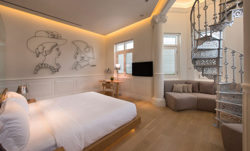
One of the rooms has a spiral staircase and wire wall art of Macalister:


And yes, they offer a room with double beds:

A narrower room features an enormous bathroom opposite the bed:


And this room has both a glass wall separating the bathroom from the bedrooom and a partitioned seating area


and the last of the eight rooms:

So, if you've been planning a trip to Malaysia, consider the Macalister Mansion.
Macalister Mansion
228 Jalan Macalister, Penang, 10400 Georgetown, Penang, Malaysia
Phone:+60 4-228 3888


